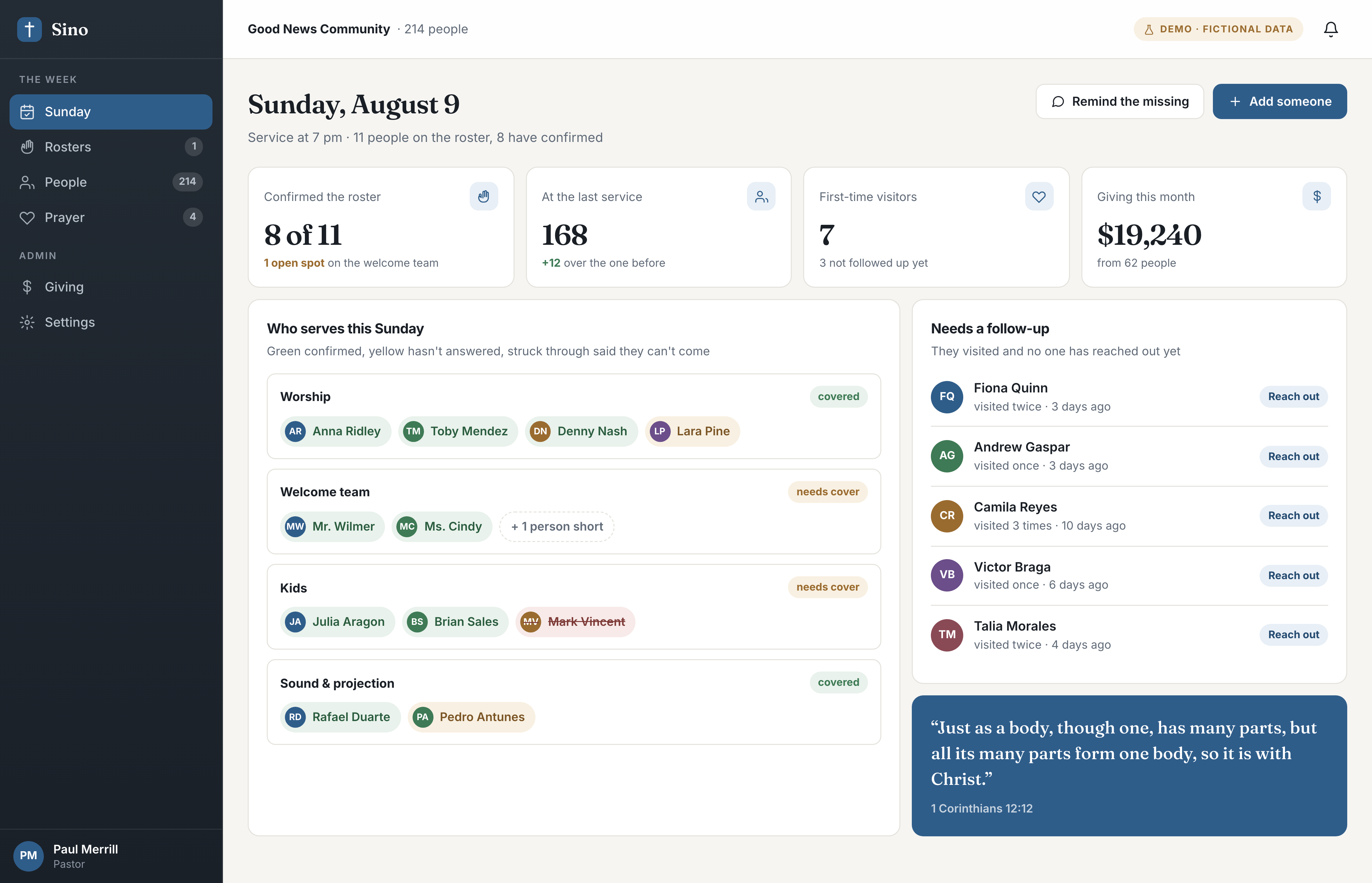
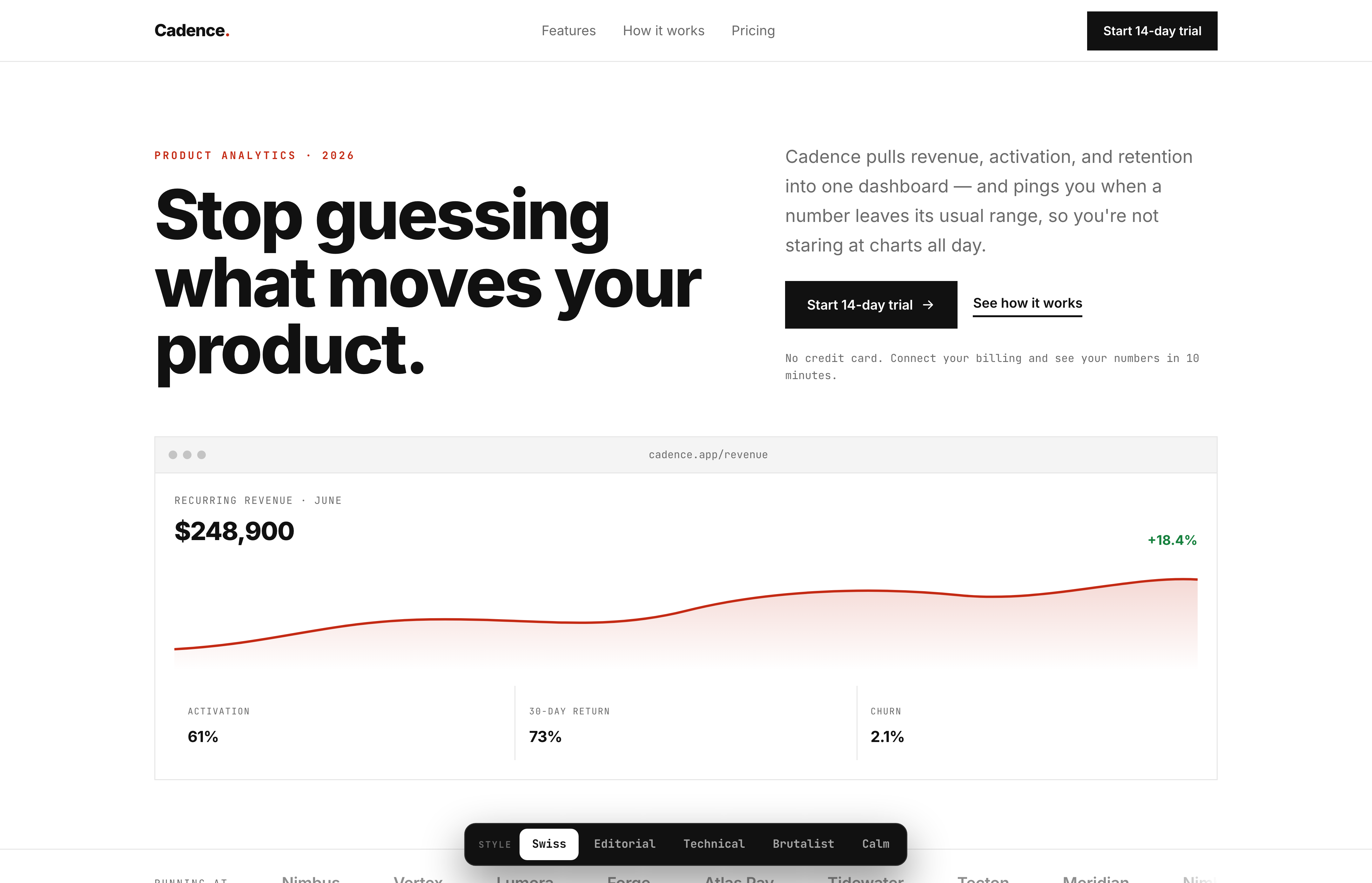
A software sales page written to convert before there is a salesperson in the conversation: features, how it works, testimonials, pricing, FAQ and a closing call to action. Built in five interchangeable visual directions, switchable in the browser. Self-initiated and navigable.
01 / THE PROBLEM
"I'll know it when I see it."
The most expensive sentence in a landing page project is the client saying they are not sure about the look — after it is built. Taste does not survive being described in a brief. Two people say "clean and modern" and mean opposite things.
The usual fix is mockups, which cost days and still show a picture rather than a page. I went the other way: build the page once, and make the direction a switch.
02 / THE APPROACH
The copy is fixed. The direction is the variable.
Structure and copy stay put across all five: the argument that sells does not change because the palette did. What changes is type, colour, spacing rhythm and how much air each block gets.
Holding the content still is what makes the comparison honest. The client is choosing a direction, not a different page — and that is the conversation worth having.
03 / THE BUILD
Six sections that carry a sale, in one file.
Features, how it works, testimonials, pricing, FAQ, close. The six blocks a software page needs, in the order that answers objections as they arise.
Pricing with an FAQ under it. Price raises questions; the answers belong immediately below, not on another page.
One HTML file, no dependencies. It opens on any phone, loads instantly, and I can hand it to a client as a link without deploying anything.
It exists to end the taste argument in the first meeting instead of the third.
Directions
5
Sections
6
File
1 HTML